







Case studyScissor Guys
A walk-in barbershop’s website. Built for the phone first.
Scissor Guys is a barbershop on Ocean Road in South Shields. We designed and built its website: one page that tells someone nearby what they need to know before they walk in.
- Client
- Scissor Guys
- Where
- Ocean Road, South Shields
- What we built
- Website
LaunchThe website
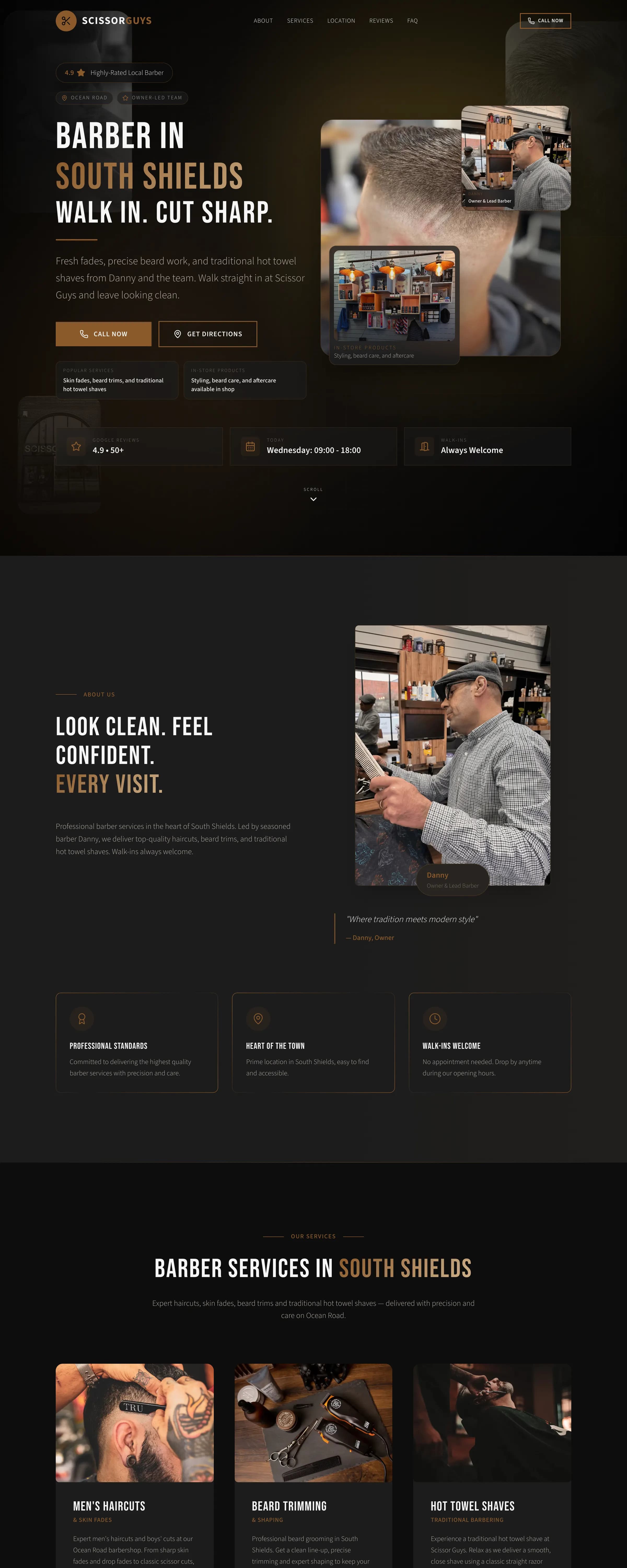
We put the whole shop on one page.
A walk-in shop needs no maze of pages. Theirs runs in the order a customer wonders: can I walk in, is the work good, where is it. This is the page itself, replayed.
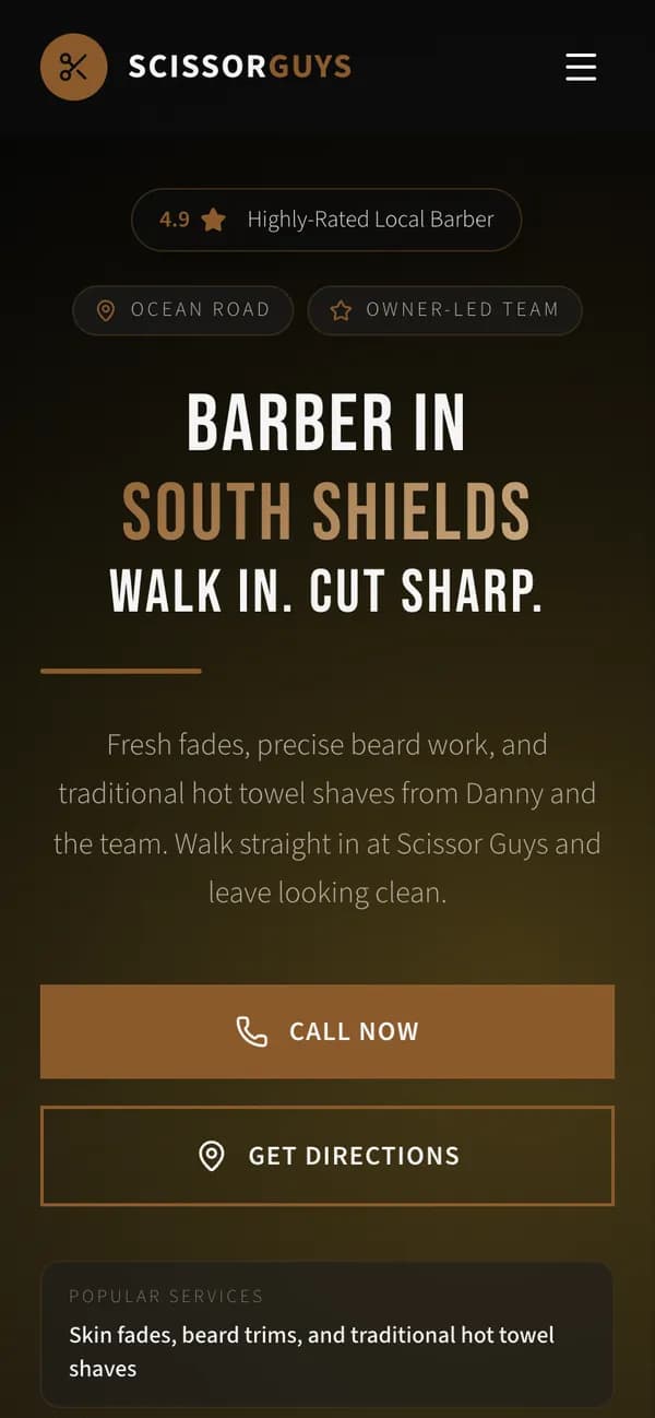
- The first screenWalk-ins in the headline, today’s hours, and buttons to call or get directions.
- The shopDanny and the team, and how the shop works.
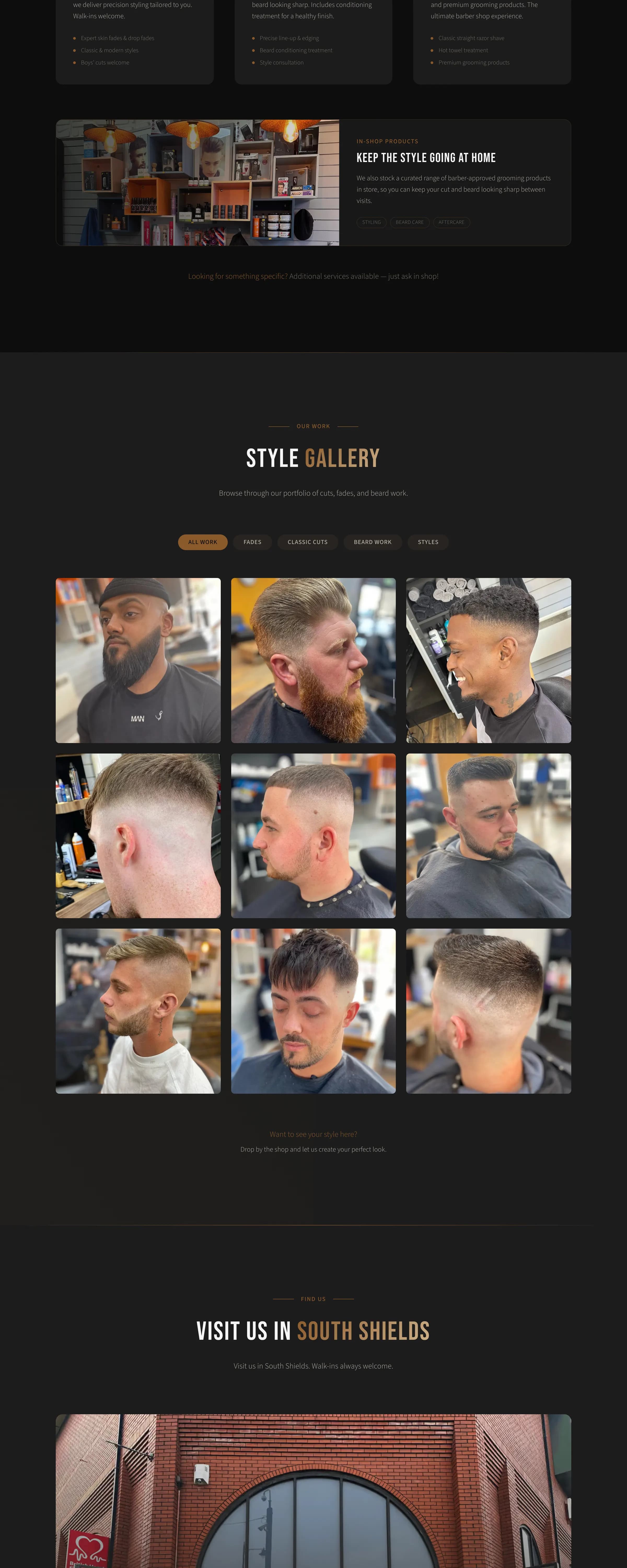
- The servicesHaircuts, beard trims and hot towel shaves, and the products on the shelf.
- The galleryTheir own cuts, sorted by style.
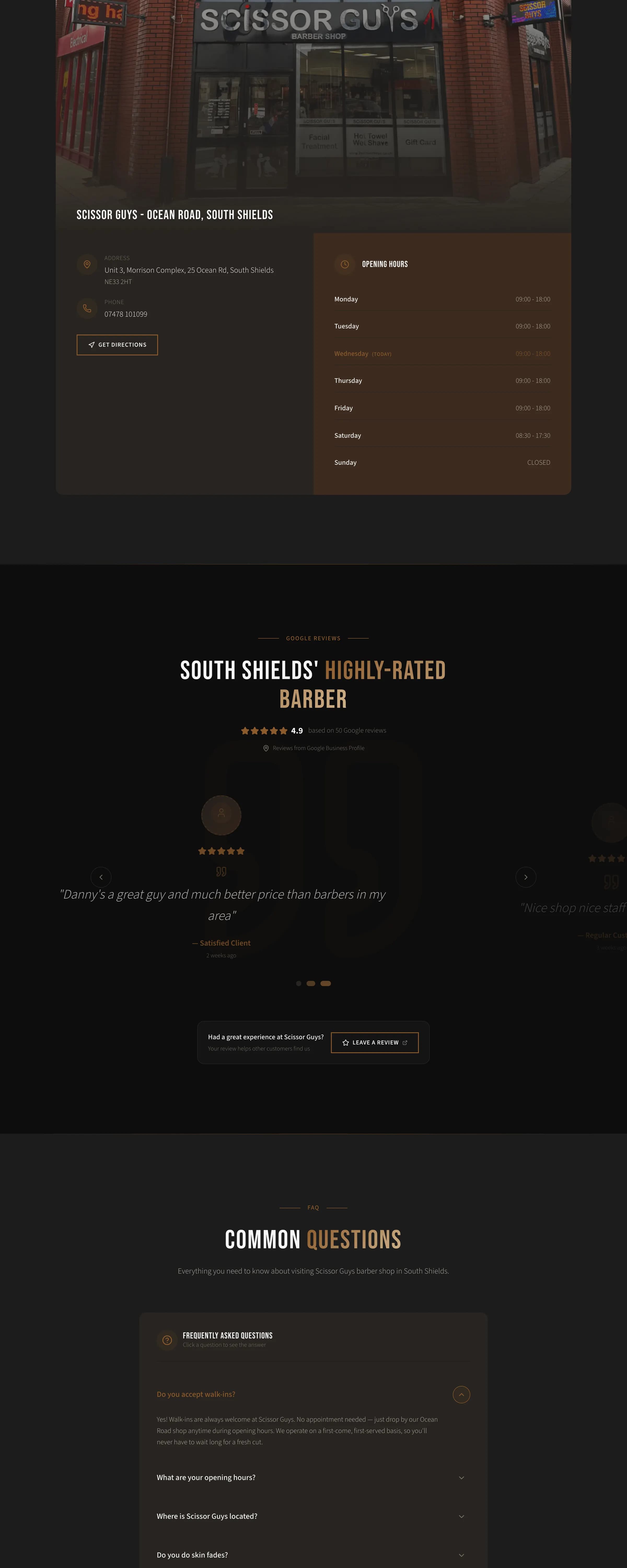
- Finding itThe shopfront, the address on Ocean Road and the week’s hours.
- ReviewsWhat customers say on Google, and a link to add one.
- QuestionsWalk-ins, hours, parking and prices, answered before anyone has to ask.
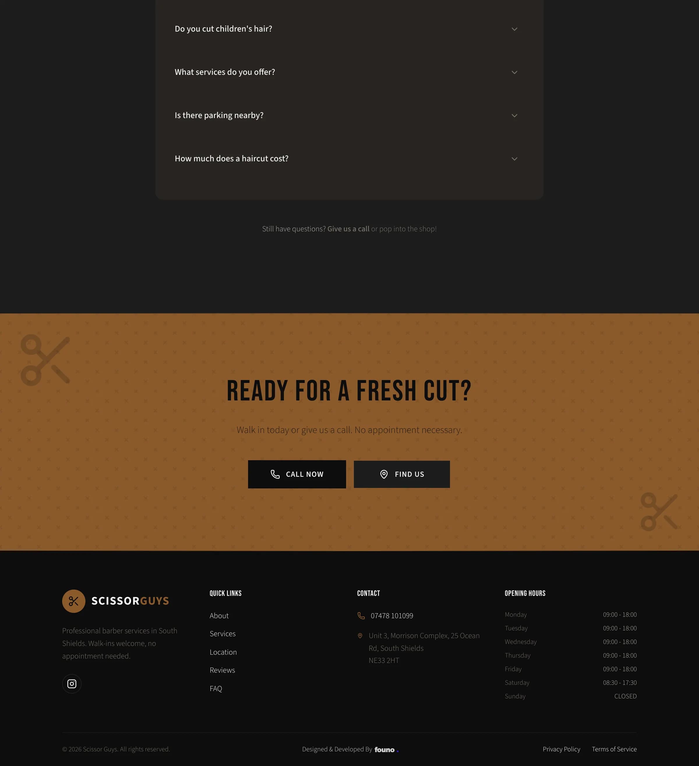
It ends on one more way to call or find them, and the shop’s details at the foot.
LaunchThe style gallery
We put their own cuts on the page.
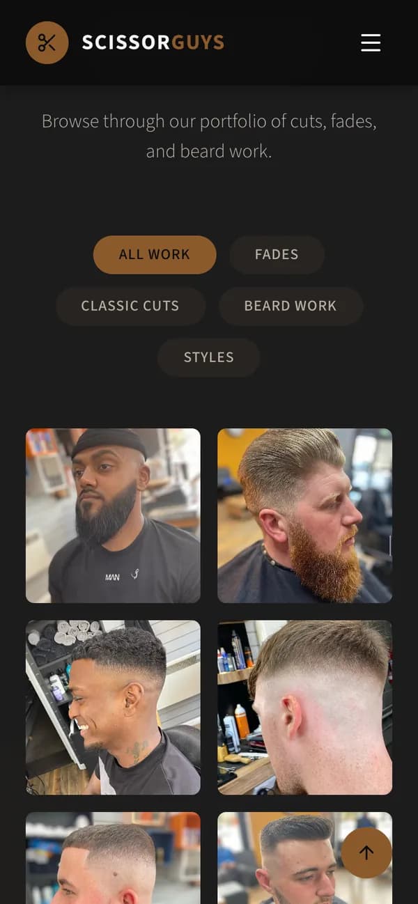
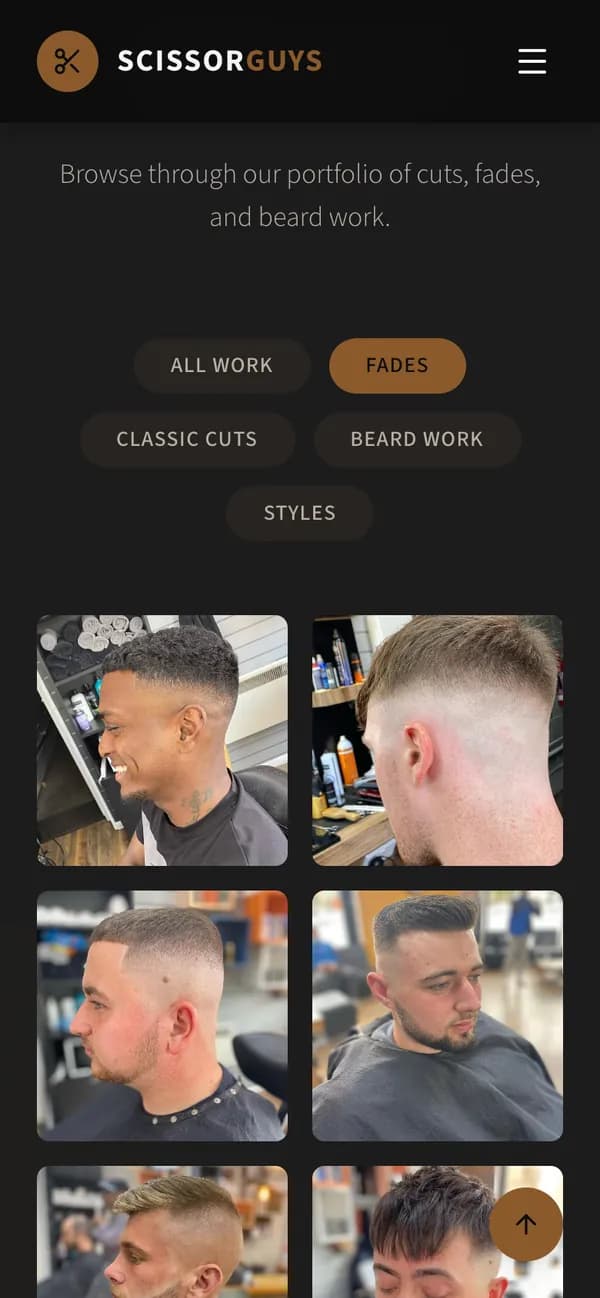
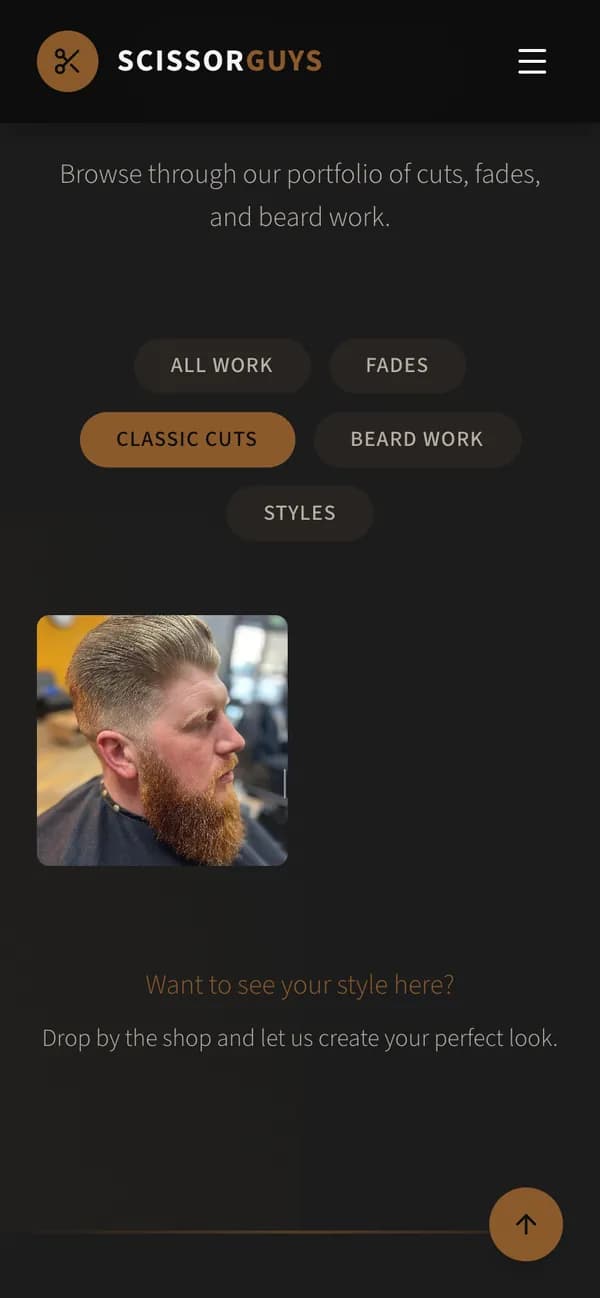
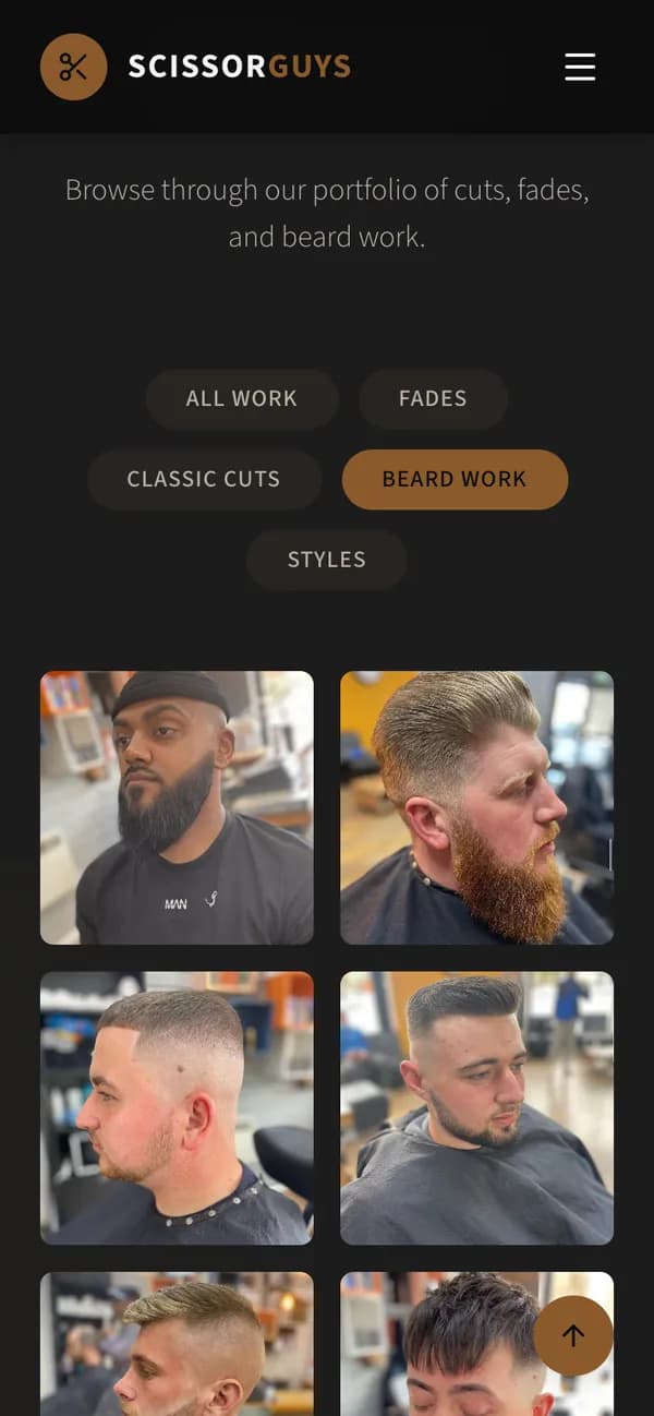
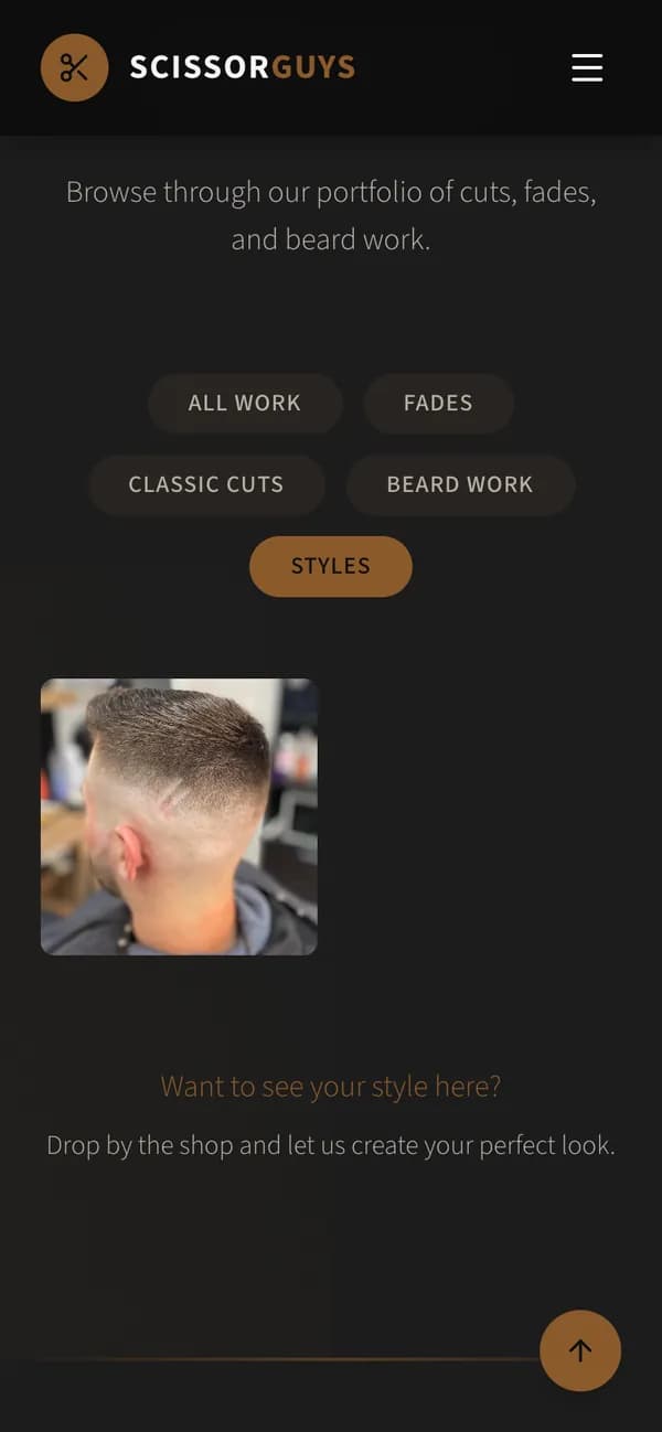
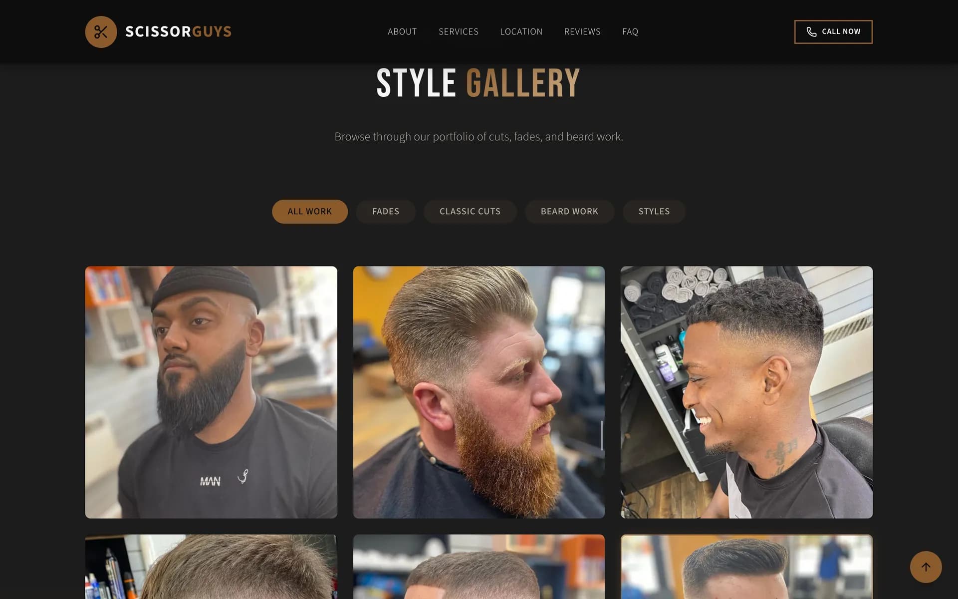
No stock photographs. The gallery is the shop’s own work, and one tap sorts it by the kind of cut someone came in for.
- All workEvery cut in the gallery, on one grid.
- FadesOne tap, and only the fades.
- Classic cutsOr only the classic cuts.
- Beard workOr the beards.
- StylesOr the styled cuts.
LaunchOn a phone
We designed it for the phone first.
Every part of the page was laid out at a phone’s size first and opened out for a laptop after. Here it is on a phone, top to bottom.
First screen 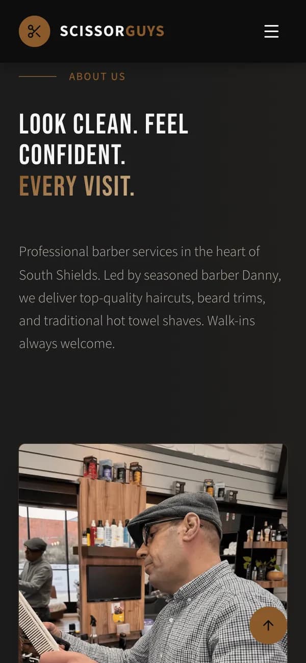
The shop 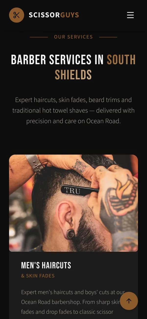
Services 
Products 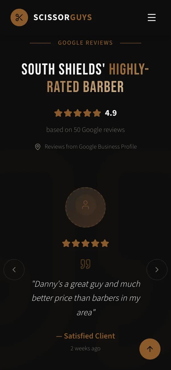
Reviews 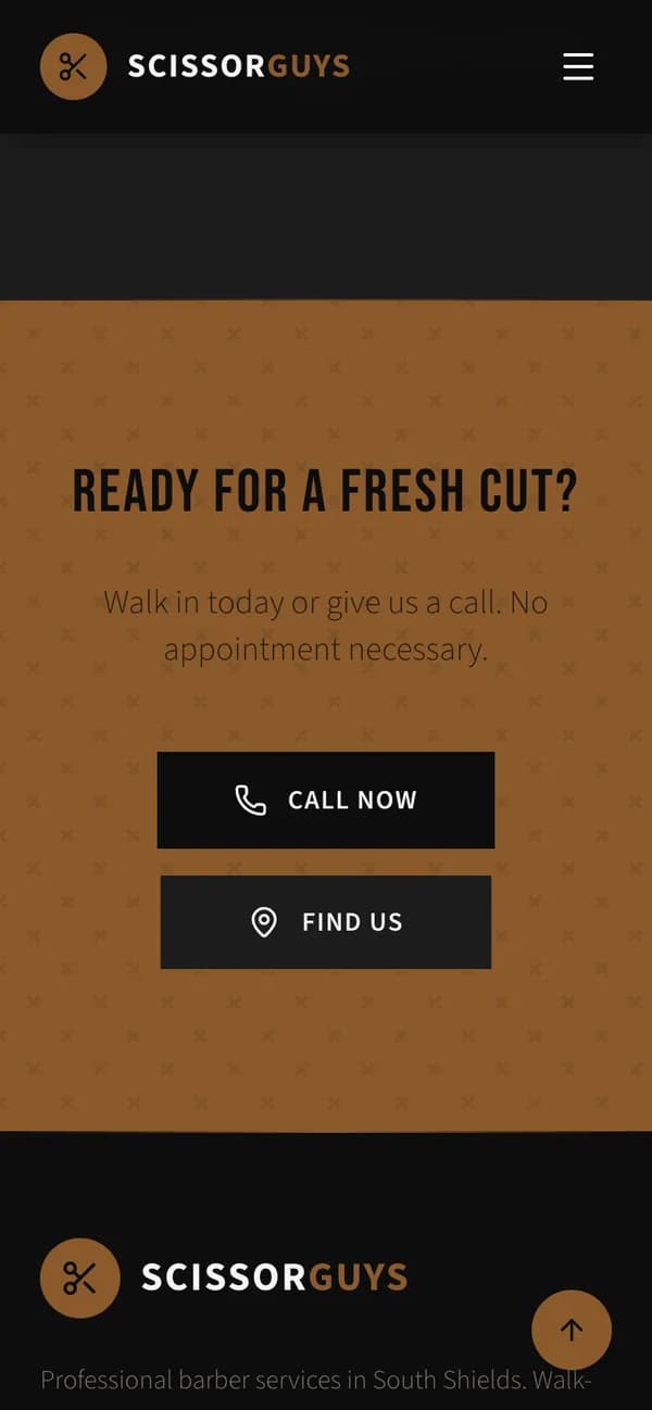
The close 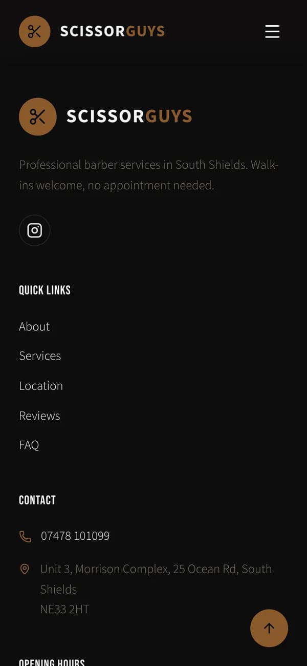
Footer 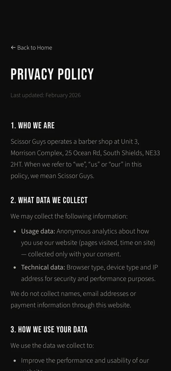
Privacy
LaunchGetting there
We made walking in the easy part.
Can I walk in, is it open now, where is it, how do I call? The page answers each before anything else, and again wherever someone might stop reading.
First screen 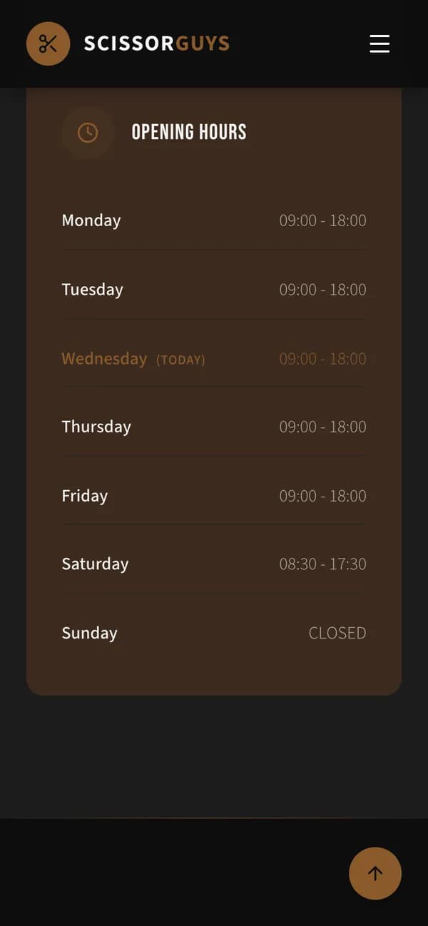
Opening hours 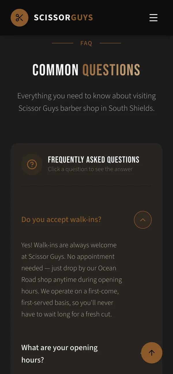
Questions
- Walk-ins
- Said in the headline, on the first screen’s cards and in the first answer of the questions.
- Today’s hours
- The first screen shows the hours for the day it is read. The whole week sits under the shopfront, with today picked out.
- Call or directions
- Two buttons on the first screen, a call button in the menu at the top, and both again at the foot of the page.
- Questions
- Eight things people ask before they come, answered on the page.
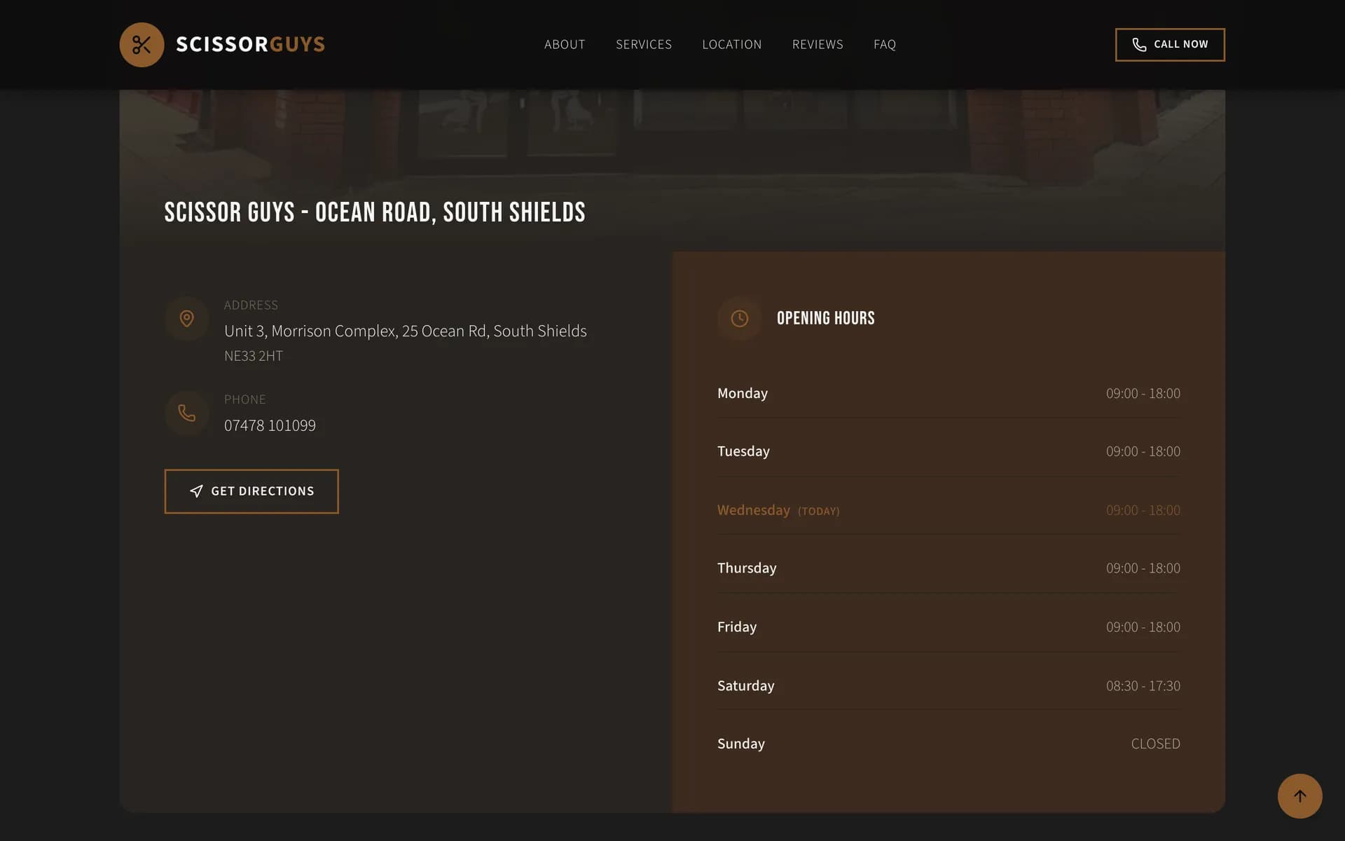
Every screen here is the live site, taken in October 2026.
What this shows, and what it doesn’t.
- The brief
- A walk-in shop lives on people nearby choosing it there and then. The page had to tell them, quickly and on a phone, that they can walk in, when the shop is open, where it is and that the work is good.
- What we built
- The website: its design, its structure and its build, the style gallery and its filters, the hours, the questions, and the privacy and terms pages.
- What it leaves out
- Booking and accounts. The shop takes walk-ins, so the page sends people to the door or the phone.
- Not claimed
- No figures for visits, calls or customers. Those are the shop’s own, and we don’t publish them.
Now picture yours.
Every project starts with what the business does. Tell us where yours gets stuck and we’ll say where we would start.